It’s fair to say that the team at f&f love layering colour within a home. So, collaborating with Bronwyn Riedel, the co-founder of Bauwerk Colour has been a natural fit.
We first partnered with Bronwyn during our Sydney Home away from home, where Bronwyn masterfully produced our first ever custom palette of six shades of lime paint. Alongside Bauwerk Colour, we teamed up with some of our fave Australian creative talent and translated their best travel memories into an inspiring palette, suited to both interiors and exteriors.
Read more about our collaboration and custom palette here

Meet Bronwyn Riedel 
Bronwyn (pictured right, alongside Lynda Gardener) is the co-founder and Creative Director of Bauwerk Colour. Living between Germany and Australia, Bronwyn spends her life experimenting and playing with pigment, minerals and colour, producing the most beautifully textured and toned paints we have ever worked with.
Bronwyn, a true authority on colour, has mastered the art of making colour both moody and light. We love the way her paints transform a space and make it look and feel loved and lived in.
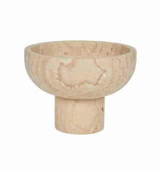
Bring nature into your home
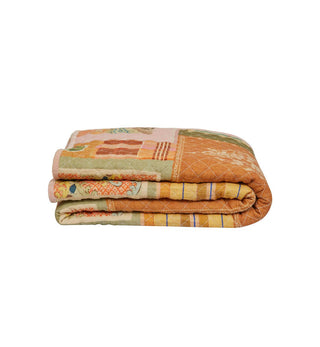
Bauwerk Colour is a specialist paint company, producing lime paints that are both beautiful in colour and texture, as well as being environmentally friendly. Consisting solely of lime, clay, minerals and natural pigments, these paints bring a bit of nature into your home. We personally love the patina these paints create and the emotion they bring to a home.
They are surprisingly easy and fun to apply, a sure fire way to makeover your space this Winter.
Enjoy our interview with Bronwyn from Bauwerk Colour as she shares her seasonal colour tips and advice.

We adore Autumn and Winter palettes at fenton&fenton - the way the light and colours go to a deeper place. Bronwyn, can you share your seasonal colour tips as we move into the cooler months?
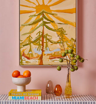
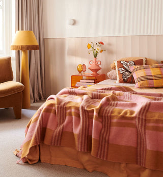
Moody colour is always great for the cooler months. Right now, I am loving deep purples and a return of terracotta. In the making, we have some bold new colours coming soon, all designed to add feeling to a space - deep dirty black with a hint of red, a moody blackberry purple, dark dark green and dark tobacco. We can't wait to share.
If going too dark is not your thing, moody neutrals will add feeling and depth to a space, whilst also keeping things light. Some of my current faves are what I call 'reworked beige tones', made more interesting with warm grey undertones. Try Bauwerk IBIZA and WHITE STAG for these hues.
What about darker colours in darker months? How would you introduce darker tones whilst still ensuring a spacefeels vibrant and welcoming?
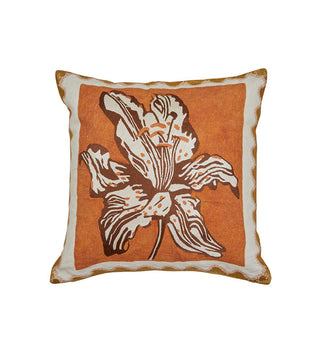
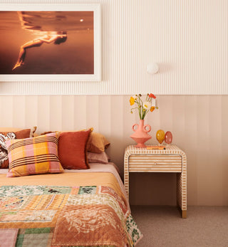
All colour schemes are improved with little accents, nature, accessories and art! I love the way fenton&fenton use accessories and art to lift a space. Patterns provide punctuation, the smaller accessories and plants add energy, and the artwork introduces boldness and light. It's all about balancing the mix. Our paints have also been designed to refract light beautifully, due to the natural pigments. So, although moody and dark, there's still enough transparency and vibrancy, ensuring the finish is never dreary!
Do you have any tips for quick and easy colour updates for those wanting to inject a bit of colour into their home without re-painting their entire home this Autumn/Winter?
Think about just painting your bedroom or living space, and then team it up with a large-scale piece of artwork. One of the quickest, most affordable and wow making ways to completely transform a room, is simply by painting it. It can be a super quick makeover that really changes the way you feel in a room. It's also a quick weekend project that will have you sitting back in your chair in love with your new space again.

What are your tricks of the trade when applying your beautiful lime paints you create? How can I create that imperfect lived in look in my home?
We always recommend people start by watching our Bauwerk Colour video! Pour a glass of wine, put on some loud music and trust the process!
Its an easy loose technique with four main rules:
1. Spread the paint over your wall in loose easy strokes, stretching the paint out as far as it will go in each direction. Then lightly pattern with the brush and move onto to the next section of wall. Do this until the wall is painted entirely.
2. Don't over apply the paint! If the paint is not spread out on the wall as far as it will go, then it cannot cure properly and powdering or 'white patches' can appear.
3. A light touch is best - you don't need to be aggressive with the application.
4. The first coat usually looks a bit funny (this is normal). Our paint is always darker and transparent when wet, then dries opaque and lighter.
What walls and surfaces do your paints work best on? Are there any no-nos?
Bauwerk Lime Paint is perfect for all masonry surfaces such as render, cement and bricks. It works best when it's absorbed into the wall leaving a breathable surface that is protected by the natural properties of the paint. It's okay if your wall is already painted or is made of gyprock or plaster. Use our undercoat/sealer if you want to hide any imperfections, then paint the way you like it best. Our paints work differently to others, working with nature. They are made with clay, minerals and beautiful natural pigments. Best of all, you'll be painting with a natural paint without any toxic fumes. A no-no is gloss paint or anything shiny as the paint cannot adhere well enough to those surfaces.

What does 'home' mean to you?
A place where you find comfort, a place that reflects who you are, and feels like you are home. I also love my own home to be full of 'new projects'! I could never buy a house that was all finished. I love to continually change things up, and love a house that no one else wants to take on! Home is where my family is.


Images of Bronwyn’s home in Germany by KRAUTKOPF Berlin
What's your colour pick of the season and what would you pair this colour with from the fenton&fenton collection of artwork and furniture?
I can't choose just one, but I am loving MEDLAR paired with the Muse series from Jai Vasicek. And, LILLYPILLY with Antoinette Ferwerda's latest body of works.


Where can our customers get sample pots and buy your paint?
Online via www.bauwerk.com.au. Here you'll find inspo, tips and everything else you'll need to know to get started!
Thanks Bronwyn. We can't wait to see and work with your new even moodier colours referenced above!
We'll leave you with this little bit of colour advice - Be brave, and go bolder and moodier than you normally would this Winter. You won't regret it!
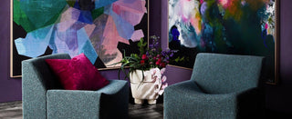
Come along to the launch of the Supernova Exhibition in-store May 3, running until May 17, and see how Bauwerk Colour and new works by Michael Bond and Antoinette Ferwerda have transformed our space.
Read our 8 tips for working colour into your home
And, check out our travel inspired hues with Bauwerk Colour here.